
/ Case study
Alike
In 2021 Alike went from a one-line stealth page to an animated Webflow site, and five years on it still runs on the same Webflow site.
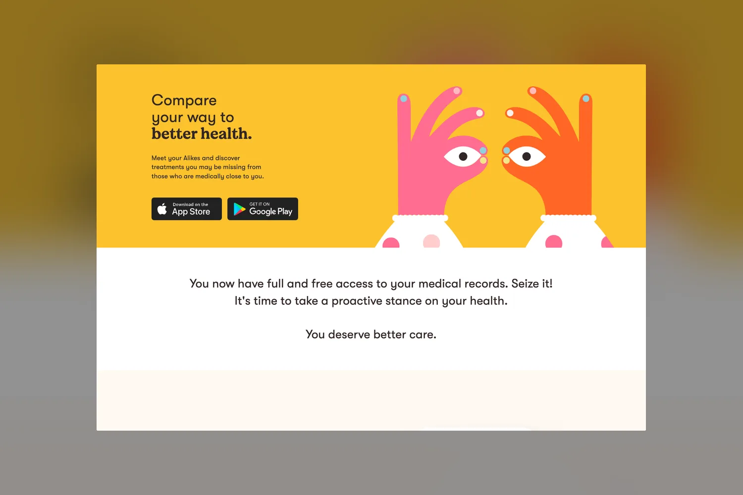
Wayback Machine captures 2020 to 2022 and the live site, 2026
Who Alike is and why it needed a real website
Alike is a social health app built on one idea: no two people are the same, but many are alike. It connects to a person's medical records, matches them with people on the same medical journey, and lets them compare conditions, medications and treatments, so they can ask their doctors better questions. Privacy sits at the center: Alike keeps no personally identifiable information on its system. Until 2021 alike.health was a stealth-mode page with one line about artificial intelligence and big data. The project came to us through RNR, the creative studio that art directed and designed the new site.
The challenge: explain patient similarity in a scroll
Alike was coming out of stealth with an app on iOS and Android. The website had to explain something genuinely complex, a similarity score computed from clinical data, to people who just want to understand their own health. It also had to answer the first question any patient asks about a health app, what happens to their data, before they ever tap download. RNR's answer was motion: show the app working instead of describing it.
How we built Alike's animated Webflow site
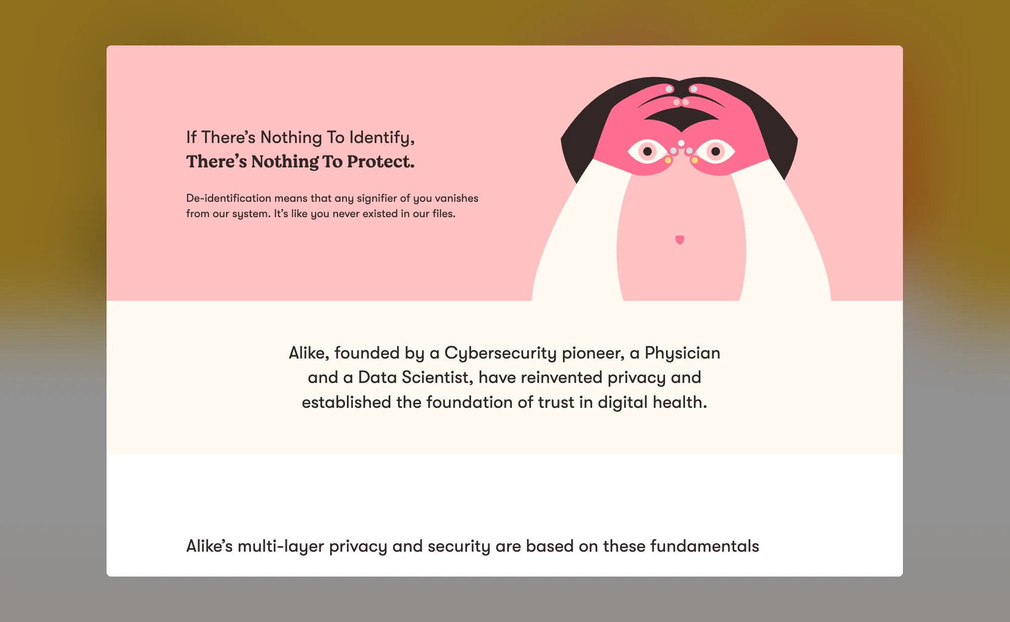
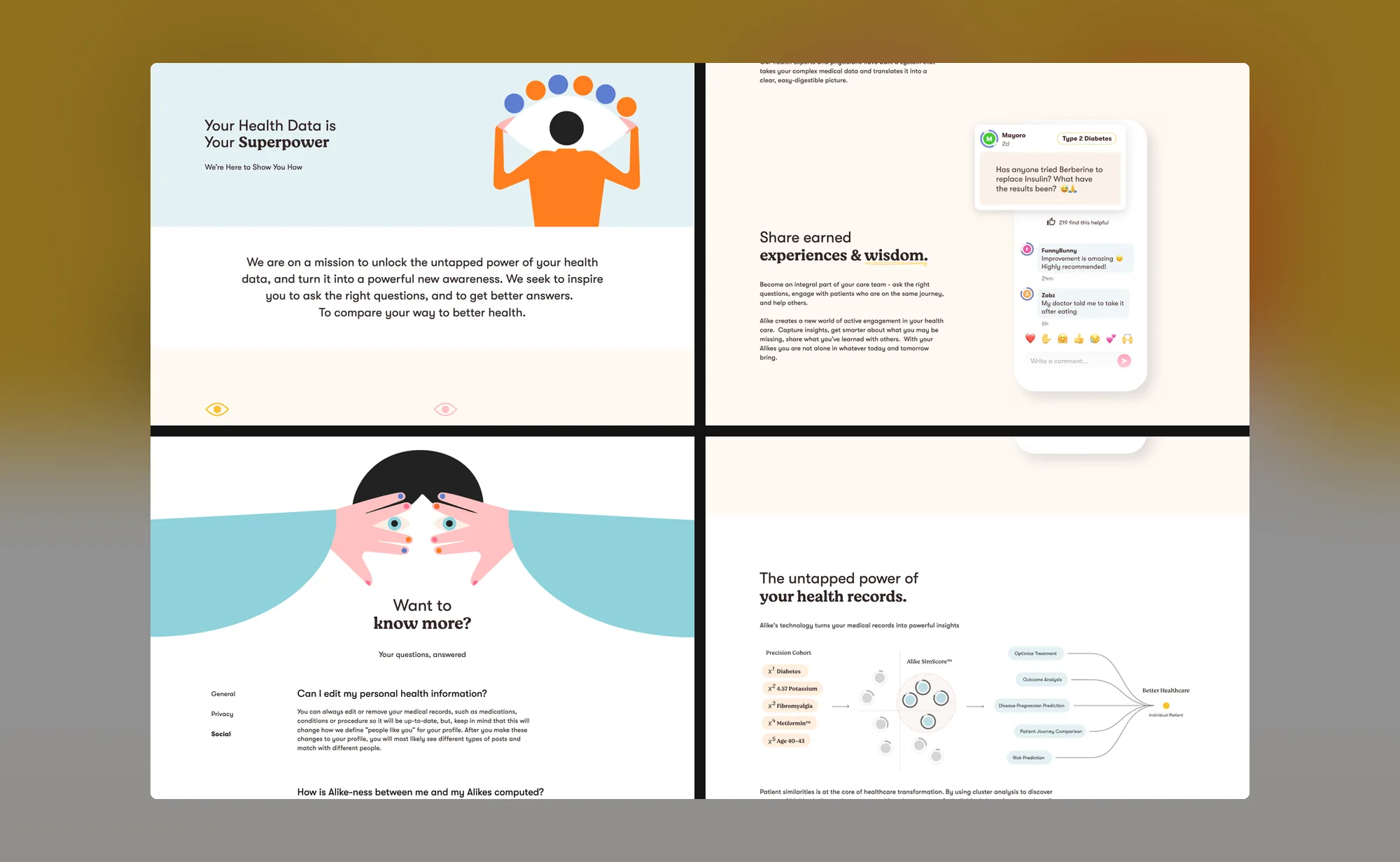
We built RNR's design in Webflow, and the site moves: phone mockups whose screens animate through the app's comparisons, an illustrated scene on the home page, and animated calls to action for desktop and mobile, all running as Lottie animations. The home page walks a visitor through the product in order: compare your way to better health, understand your records, share what you have learned, then a plain explanation of de-identification and three simple steps to get started. Around it we built About, a Blog, a page on Alike and your privacy, a Help page with frequently asked questions, and the privacy policy and terms.
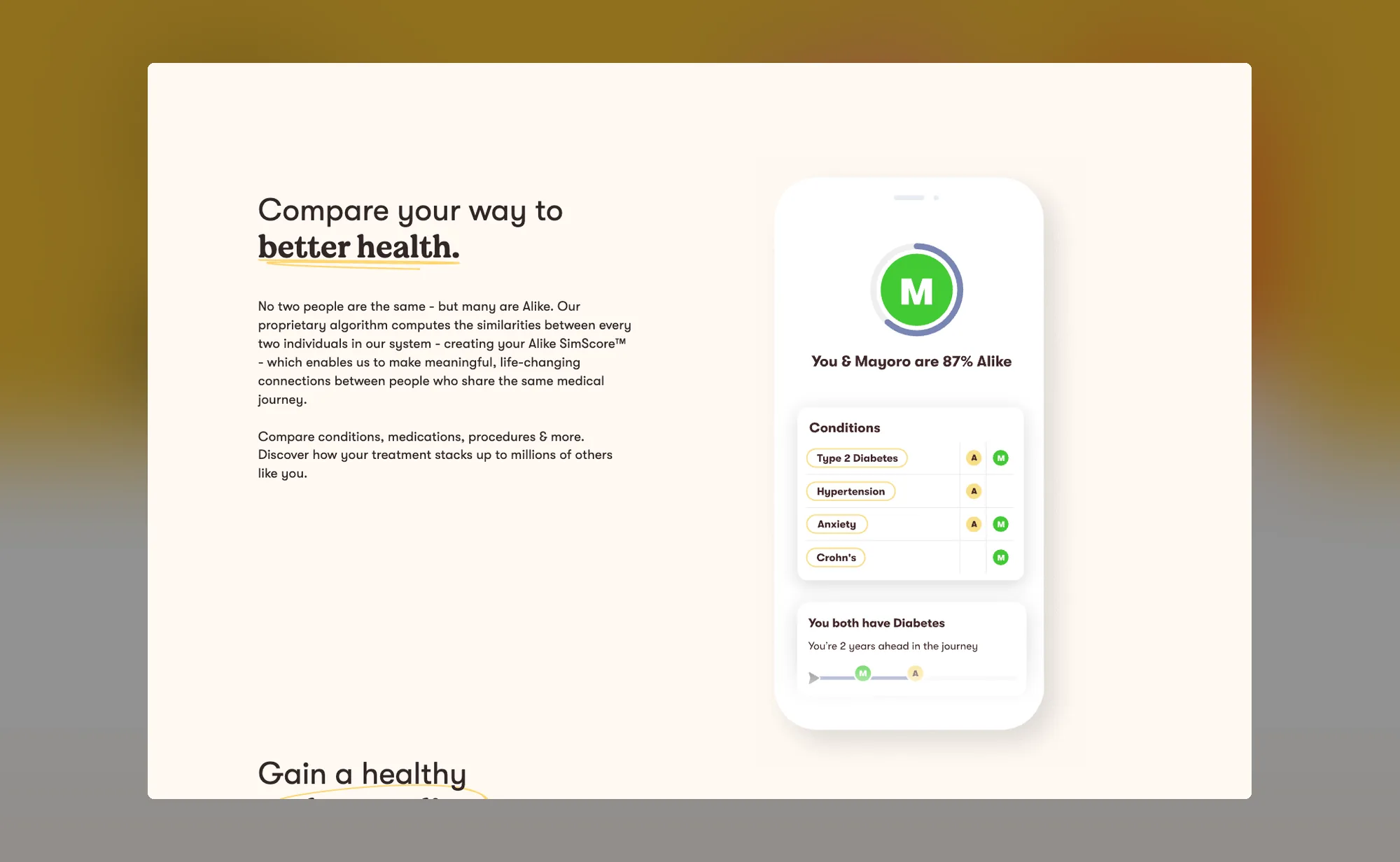
- 7 Lottie animations on the home page
- 7 pages at launch, from Home to Terms
How Alike launched
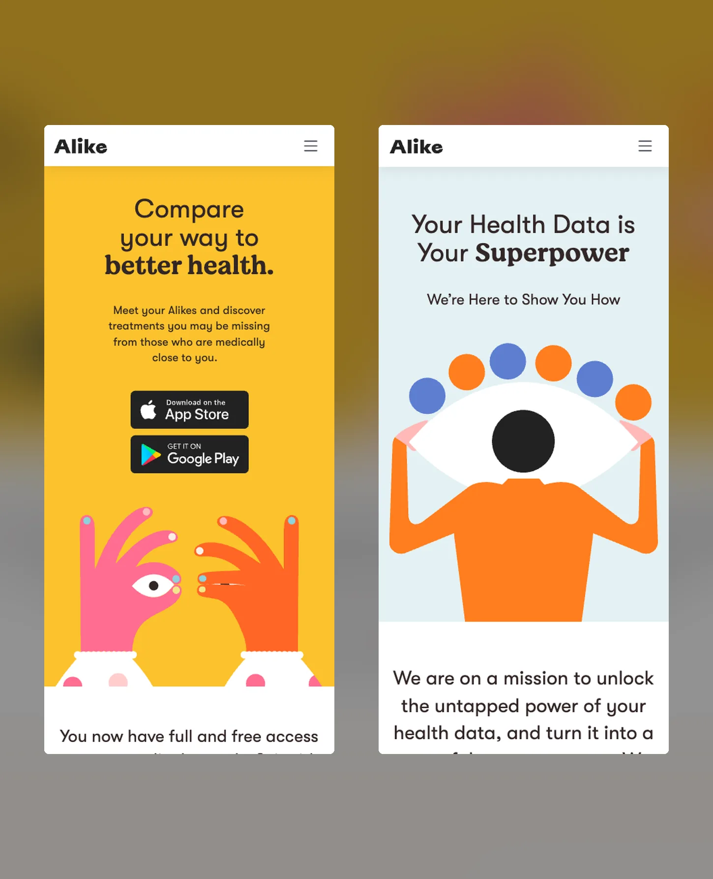
The new site was live on alike.health by June 29, 2021, replacing the stealth page. Within weeks a FAQ link joined the main navigation, and the site kept the same structure and animated home page through mid 2022 as Alike updated its copy.
What happened after launch
Alike kept building on the same Webflow site. Its message has since moved toward patient connection, and the pages have changed with it, but alike.health still runs on the Webflow site created in May 2021. A site that can carry five years of product changes without a rebuild is the outcome we aim for on every Webflow project.
- Since 2021: alike.health on the same Webflow site
Credits
Client: Alike Health
Art direction: Gabriel Rimmerman (RNR)
Design: Carolina Romero (RNR)
Webflow development: the Fri3nds team
Services: Webflow development, CMS setup (blog), responsive build
Let's get your next pageout this week.

Some months need more than the block of hours covers. The same team scales up for a launch, a rebrand or a migration, without a new onboarding.
Book a free discovery call